As software developers, we love to delve deep into technical matters and write code that delivers value. It’s not a big secret, however, that many problems in software originate with people and not technology. In my experience, the biggest issues arise mostly due to corporate politics, lack of shared values, poor attitude, inadequate communication skills, and, lastly, faulty perceptions.
Ultimately, the way we see the world affects the way we logically reason about it.
Imagine a team of developers and a customer discussing what to do, using agile stories as their starting point. I use the term “customer” to describe the role of the domain expert who prioritizes stories and can clarify what problems a new system is supposed to resolve. Ideally, the customer knows precisely what to program and the team knows exactly how. More realistically, however, requirements evolve both as the team better appreciates the nuances of the business domain and the customer realizes the possibilities and constraints.
But what would happen if both the customer and the development team had a truly open mind and a willingness to be wrong? What solutions would they come up with if they all had a creative attitude and used a language designed to help them restructure their thoughts? I’m suggesting a catalog of practical refactorings and patterns that would add some rigor to anyone’s thinking process!
The great creativity masters can teach us very relevant lessons in this context. Edward De Bono’s “Serious Creativity” book, for example, contains lots of insights and sets the foundation of the first thinking pattern I’m going to introduce:
Extract Concept
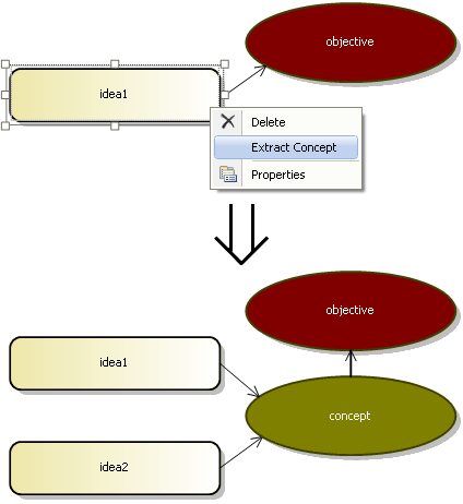
You have identified a concrete idea that addresses a given objective.
Extract a broader concept to facilitate the creation of alternatives.

Motivation
Extract Concept is one of the most regular techniques I use to deliberately increase my ability to generate alternatives. In fact, it is so basic that, at first glance, it might even seem too obvious. But don’t be fooled. Its mechanism taps into our human talents of abstract thinking, and it is a good step towards sharpening our creativity skills in a disciplined way.
Perhaps the most important benefit is that it forces me to look for alternatives even when I’m fairly confident that the first idea I have is good enough: I’d ask questions such as “this is a way of doing what?” and “how else can this be achieved?” This attitude is particularly important as I know that if I blindly trust my first instincts I may miss tremendous opportunities.
Alternatives must have a reference point: I’d ask “alternatives with reference to what?” A new concept becomes a fresh reference point that can somewhat change my perspective and lead to further ideas.
Mechanics
- Define the objective. It might be general or specific, but make sure that you are very clear about what you are focusing on!
- Identify one or more ideas relevant to such objective.
- For each of those ideas, extract a broader concept by asking: “this is a way of doing what?“
- See how each concept can trigger further alternatives by asking: “how else can this be achieved?“
- If applicable, find further alternatives by extracting an even broader concept (a direction) from one or more existing concepts.
Example
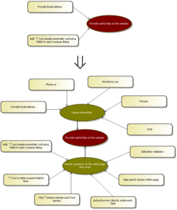
- I start defining the problem: “Provide useful help on our website”.
- I quickly identify as many relevant ideas as I can. In this case is pretty easy to get a good few of those, but let’s pick 2 of them for simplicity sake:
- Add “?” icon beside potentially confusing fields to open a popup dialog
- Provide Email address
- For each of those ideas, I extract one or more concepts:
- Using the “?” icon, is a way of answering questions on the same page they arise
- An email could be seen as a form of human interaction when visitors can’t find the help they need.
- Using each concept, I can now identify more alternatives:
- The concept “Answer questions on the same page they arise” leads me to the following ideas:
- Use the “?” icon to inline-expand helpful hints
- Add permanent “why?” sections beside each form section
- Add (light-grey) instructive text directly inside each field (that disappears when the visitor clicks on a field)
- Add help search section within page
- Add inline validation (to show error messages within the form before the visitor has the opportunity to click the button that submits the form data
- …
- The concept “human interaction” helps me finding further alternatives:
- Phone us (visitor calls us)
- We phone you (visitor gives us his/her number, we call)
- Forums (let visitors help themselves)
- Chat
- …
- The concept “Answer questions on the same page they arise” leads me to the following ideas:


Very helpful. We use this technique in our brown paper sessions and IAF framework.
Hey Paul thanks for leaving your comment! Although I use this technique all the time, it took a fair bit of effort to write, so I’m really glad to get some feedback; I have way more “subversive” techniques to share. With a bit of patience I’ll add more to this catalog 😉
I’m also embedding some of these techniques to an experimental Visual Studio DSL Tools designer that I’m building, by the way (the diagrams on the post are from Visual Studio, as you may imagine). It is early days, but it might lead to something fairly useful.